Work In Progress
|
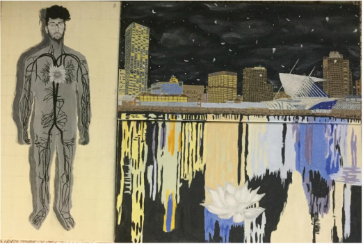
Title: The Butterfly Effect
Medium: Acrylic on Canvas Size: 91x61cm Date: April 2016 Exhibition Text: Inspired by Frida Kahlo’s The Two Fridas, and Hal Koenig’s Marine Plaza, this piece deals with the fragility of individuality. A white lotus is shown in bloom in the boy’s chest in place of the heart. The contrast between black and white creates a visual binary opposition. Everyone has these elements and conflict within them, however overcoming the idea of individuality and embracing a unified world is essential here. One is all and all is one.
|
|
Planning: The project was to be one that is say the 'masterpiece' of my junior year. The implications and meaning should be personal and have relevance to me. My goals were to portray how I viewed myself, how the city affects me, and how I affect the city. Brainstorming and toying with ideas for the first few days, I knew immediately what I wanted to do. At first, I thought I do not affect the city at all since I am just an individual but when I delved deeper, I realized that every action has a reaction whether that reaction be insignificant or powerful. To display the butterfly's fragility I used my body as the vessel for a blooming lotus flower. The colors represent the binary opposition which everyone carries inside themselves. The white lotus flower has black roots that are in an accurate representation of a human's circulatory system. The heart is replaced by the lotus flower which is the accumulation of all feeling in the boy's chest. Instead of the roots being protected underneath the earth, they are exposed as if they are the ones protecting the lotus flower. For the other two canvases, I decided to portray my effect on the city and it's effect on me by deciding to paint the Milwaukee Skyline with the recurring lotus flower in the form of petals. For the last canvas in this triptych, the lotus flower is resting on the water outside the city limits.
|
|
|
Technique: I began my work painting the canvas an off-white yellowish hue to indicate the color of parchment. By gridding out the first canvas I formed an outline that was then filled with a base color, gray. Now I had to make sure the circulatory was represented with an accuracy. I began by freehanding the veins from a reference photo in my IB HL Biology Textbook. The sketching definitely avoided any mistakes that could have occurred via a slip of the hand or carelessness. From there on I used a round size 1 paintbrush for accurate tracing of the pencil lines. The flower was painted after I had formed three hues of white. This allowed me to add depth and a sense of 3D to the flower. The face was made with same technique and long sinuous strokes were practiced for the hair. I followed the same method for the city and the water reflections.
Experience: The buildings could have been done with great ease had I decided to paint them solid off-black and then add yellow squares to represent the lights. However, I had to display the city accurately so I used various hues of brown and grey. Mixing the color definitely came easier than the first time I was painting my self-portrait, Forward. However, perspective became difficult as I had to add the numerous floors of the buildings. I then knew that I could not be lazy and freehand the floors so I used a ruler for those as well. After I made sure my edges were clean I focused on the sky which was just black at one point. I used a rag to spread white paint. These created wispy clouds. From there I used the round size 1 brush for distant stars and gracefully falling petals. The Art Museum designed by Santiago Calatrava was difficult due to the many details it harbored. I used pen and a ruler for the lines and different hues of white. Once again, outlines in pencil were done before using paint. The rocks were created with dabs of paint and the reflections required long paint strokes. The reflections at first were completed very terribly due to the thick texture of the paint. I learned that I should mix the paint with more water for a smoother look and it worked! I kept a spray bottle of water close by to keep my palette from drying out since working in acrylic is a race against time. This worked wonderfully. However, the third canvas took extremely long due to my mistakes.
Inspiration: Frida Kahlo displayed graphic human anatomy as a means of a testament to her emotional suffering from a life where health was significant. That attracted me very much since I too wanted to focus on emotions. Hal Koenig is a local artist that uses his architectural skills in painting city landscapes. I visited his art gallery and found out that he freehands most of his work. His work aided in the detail I desired to put in my painting. The city is full of colors and I'm glad he chose such a wide palette. When one thinks of the city at night most think in two colors yellow and black, but I wanted to focus on the true colors that are evident at night.
|
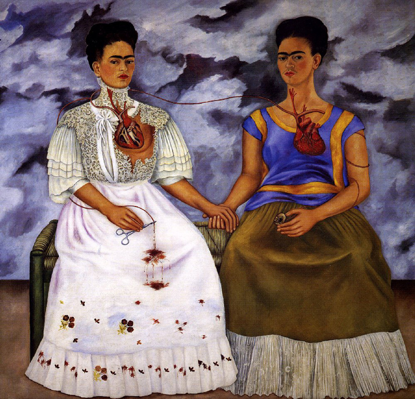
Frida Kahlo. Las Dos Fridas. Museum of Modern Art Mexico City, Mexico. 1959. Oil on Canvas.
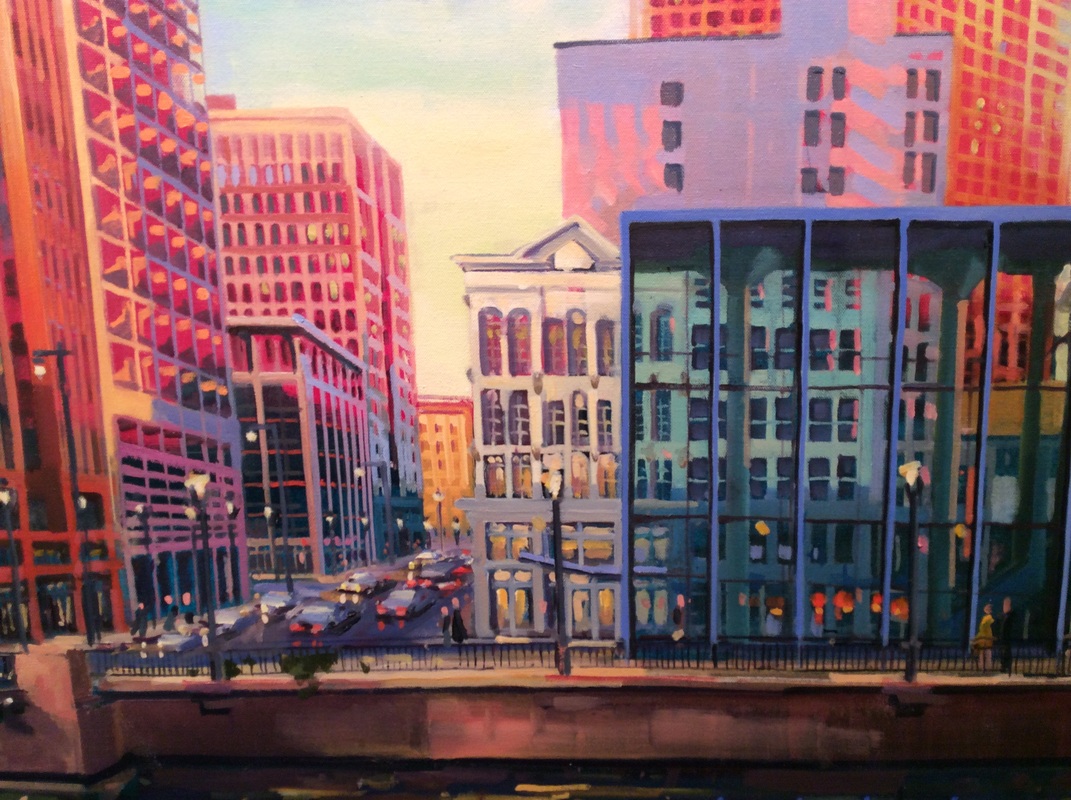
Hal Koenig. Marine Plaza.
|
Critique: This piece was completed successfully. What I wanted to convey was conveyed. The end result matches with what I envisioned in my mind. The goals were met however, I could have done better on some of the techniques. Using a rag to create the clouds was a mild success. I wanted the clouds to have a softer feelings. The clouds need a more defined value. The two-point perspective was also sketchy as I did not have points I was tracing every line to. One failure that stands out to me is on the very first canvas. The gray body looks flat and not 3D which was not what I was aiming for. Attempts were made to fix this with the darker gray shadow but to no avail. Overall, I believe I captured what was in my heart on the canvas which I believe to be a great success but the techniques were not performed with proficiency I expected from myself.
