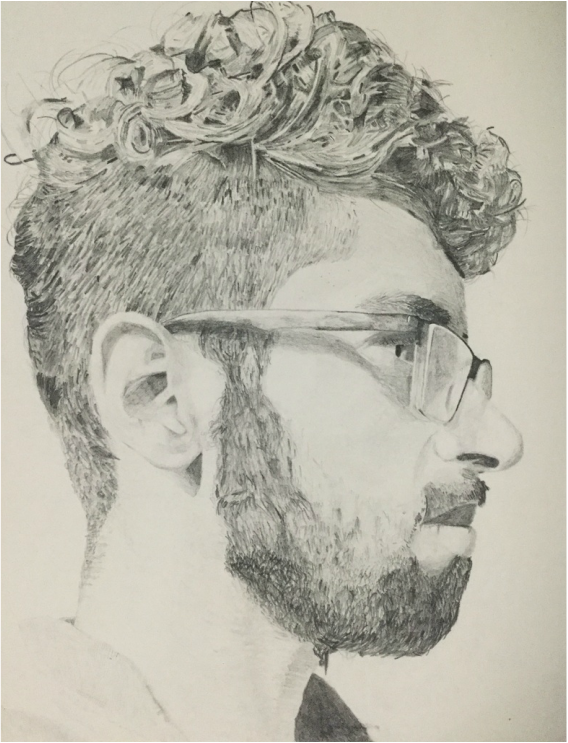
Process: I started off by taking a reference photo which I would refer to very often when drawing. I had experience with drawing before but I believe I reached a milestone with this piece because my earlier drawings did not have such a large range of value which gives off the impression of 3D. I achieved this by varying pressure and the type of pencil I used. First I had the reference photo gridded out on Photoshop and did a light outline of it using the HB pencil. Afterwards I started from the bottom and applied different pressure to accomplish the effect of light on my shirt. Moving up the picture, I learned as I went. At the neck the pencil I was using was not giving me a uniform shade so I switching to crosshatching utilizing only horizontal lines. I did not want to smudge the pencil because it has been disastrous in my past experiences. When working on the back of my head, I had to pay attention to my hand movements as they dictated the movement of hair, which must be natural. I drew the lighter parts with the HB pencil and then switched to 2H for the intermediate range of value and for darker value I used 4B. I went back in utilising 2H to blend together the strands of hair by using quick flicks of the wrist.
Next up, I focused on my facial hair which I had to take at a very slow pace. I focused on one grid square at a time. Using the three pencils almost simultaneously I drew areas where the facial hair was more prominent ergo darker and where they were patchy (lighter value). I would always go back with the 2H pencil for blending and smoothing what needed to be smoothed. For the lips I did not smudge and used different amounts of pressure. Working upwards, as I reached the the ear I hunched over the page and meticulously shaded it in. After the facial features were completed I focused on my skin. I never created highlights in this drawing; I only added value and left the lightest areas the off-white color of the paper. I deployed the same technique that I had used on my beard on the top of hair. I worked one grid square at a time using all three pencils. For the finishing touches, I referenced my photograph and added anything I had missed. I used an eraser to erase any parts where I may have accidentally added value due to the movement of my hand on the paper. However to limit this, I used another piece of paper on which my hand would rest to ensure unnecessary smudging would not transpire. ACT Questions:
1) Clearly explain how you are able to identify the cause-effect relationships between your inspiration and its effect upon your artwork. -The detail attributed to Jan Eyck work can also be attributed to mine to a certain extent. I was meticulous with even the most insignificant things to create a Realistic self-portrait to the best of my ability. Jan Van Eyck also displays such fervor and diligence in his work. 2) What is the overall approach (point of view) the author (from your research) has regarding the topic of your inspiration? -Jan Van Eyck was a artist who did the best he could as and as a result he created this piece. Some speculate the piece was created to demonstrate his skills to future patrons. He would show them the piece and the incredible detail of it would only be rivaled by Jan Van Eyck's face. 3) What kind of generalizations and conclusions have you discovered about people, ideas, cultures, etc. while you researched your inspiration? -The Renaissance was a period of re-visitation of the earlier Greco-Roman works in which they sought validation for current events and way of life. Aristotelian philosophy along with mathematics and architecture were revived to bring about the advancement of mankind. 4) What was the central idea or theme around your inspirational research? -The artistic revolution began in Italy and spread to other areas in Europe. Art began to be integrated with Science and looked more realistic. Artists began to focus on form and the use of perspective. Oil on canvas was a la mode. 5) What kind of inferences (conclusions reached on the basis of evidence and reasoning) did you make while reading your research? -During the Renaissance the standard of art was very strict and in order to make a living as an artist, the artists must excel in oil on canvas, form and perception. Later in the 1500s, art was often commissioned by churches and the papacy. |
Title: Self-Portrait #2
Medium: Graphite on Paper Size: 23x30cm Date: November 2016 Exhibition Text: Inspired by the Renaissance movement, I decided to emulate the detail in graphite. Self-portraits are capable of telling a lot about the artist. If done over-time it reveals changes overtime. Value is varied to show the interaction with light and give a 3D illusion on a 2D surface. I tried to capture every minuscule detail in hopes of realism. Although photographs can achieve realism, smaller aspects can be explored and augmented by the artist through their choices in other mediums.
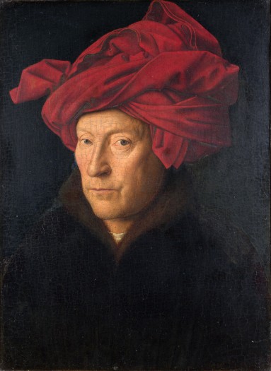
Jan van Eyck. Portrait of a man. The National Gallery, London. 1433. Oil on canvas.
Artistic Inspiration: Jan Van Eyck was a prominent Northern Renaissance painter. Van Eyck created oil paintings with excruciating detail. This is considered to be his self-portrait due to the frame in which Latin letters are painted stating "Jan Van Eyck made me on 21 October 1433". Perhaps he wanted to create something with the intention of documenting a certain period in time for others to see, 500 years later. Likewise, I want to document a period of time in my life that I can maybe look back on. Self-portraits, especially, if done annually or during a tumultuous part in life can convey the feelings and emotions tied to that time period. On top of the Van Eyck's self-portrait are Greek letters that state 'As I can' which is often what scribes would end their manuscripts with. This could be interpreted that it is the best Van Eyck can do. Sort of like a piece to demonstrate his abilities to patrons or commissioners. Similarly, I also try to do the best I can and try to achieve that with detail in my work.
Experience: This piece was a wonderful experience for me and I enjoyed every bit of it. I did not have to deal with blending acrylic paint or dealing with canvas. It was soothing to work with pencils as they are so user friendly. Using a grid really aided in giving the illusion of 3D on a flat surface. Furthermore, Photoshop allowed me to zoom in on my photograph so I could capture the details better. I also unsaturated the image so I could better capture it in my drawing since I was drawing without color.
Critique: I feel as if I was successful with this project. I wanted to draw myself to the best of my ability using the tools I am most familiar with. I captured all the details however most if not all could have been drawn better. I wish I spent more time on it as it would've led to a better end-result. I also wished I had a greater range of pencils so I could truly achieve the blackest and lightest of blacks. In the future, I will work on applying these skills to oil painting because Van Eyck's piece is in oil and I can see how oils work in the hands of an expert. They appear to be less aggravating than acrylic or so I hope. With this piece I wanted to document the time passed between my first self-portrait back in December 2015 and now. Time waits for no one and it is an important ally if you allow it to be. With all the events that transpire within a set amount of time you can't really be sure of the person you will turn out to become. It is important to reflect back what has happened and move forward stronger than ever and that is what I wish to capture within my self-portraits.
|
Word Count: 946
Citations:
Dr. Steven Zucker and Dr. Beth Harris, "Jan van Eyck, Portrait of a Man in a Red Turban (Self-Portrait?)," in Smarthistory, December 11, 2015, accessed November 26, 2016, http://smarthistory.org/jan-van-eyck-portrait-of-a-man-in-a-red-turban/.
Dr. Steven Zucker and Dr. Beth Harris, "Jan van Eyck, Portrait of a Man in a Red Turban (Self-Portrait?)," in Smarthistory, December 11, 2015, accessed November 26, 2016, http://smarthistory.org/jan-van-eyck-portrait-of-a-man-in-a-red-turban/.
