1) Clearly explain how you are able to identify the cause-effect relationships between your inspiration and its effect upon your artwork.
Influenced by the Renaissance movement, I have always paid attention to detail and trying to make my drawings realistic. Consequently my artwork represents that through the preliminary step of gridding out my work, and paying attention to human anatomy and the effect of light. Many of my self-portraits and portraiture in general is looking upon myself as a person and capturing how I view myself.
2) What is the overall approach (point of view) the author (from your research) has regarding the topic of your inspiration?
Paying attention to the natural world, emotions, and how it interacts with human beings is often the subject of my artwork. Raphael Sanzio and Da Vinci especially paid attention to detail and capturing emotion in religious paintings. Although the religious portion is left out, the same care is still applied and this summer experimentation is for further works in the traditional medium of oil.
3) What kind of generalizations and conclusions have you discovered about people, ideas, cultures, etc. while you researched your inspiration?
Renaissance art was a revitalization of science and knowledge that was once ignored. Although religion seemed to remain prominent, many paintings had an underlying science aspect to them. The Renaissance was the transition from the Medieval Period to modern art with advances in areas such as philosophy, literature, music, and science.
4) What was the central idea or theme around your inspirational research?
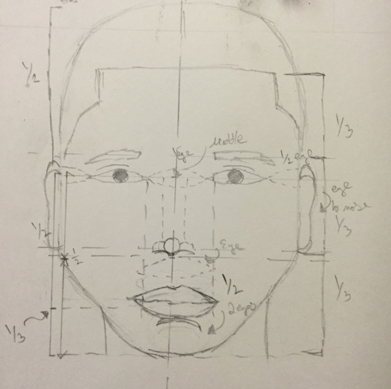
I wanted to create a realistic model of a human face so that emotions could be conveyed through the detail in the eyes and the effects of the light. While researching I looked into techniques such as perspective and studied the human skeletal system for furthering my art pieces.
5) What kind of inferences (conclusions reached on the basis of evidence and reasoning) did you make while reading your research?
Renaissance period had a lot of oil on canvas paintings. A traditional style of art was kept and many artists did not deviate far from the standard, since the higher status people of the city held vast influence and could affect an artist's career. This period depicted religious figures and portraiture as the general commissions.
Influenced by the Renaissance movement, I have always paid attention to detail and trying to make my drawings realistic. Consequently my artwork represents that through the preliminary step of gridding out my work, and paying attention to human anatomy and the effect of light. Many of my self-portraits and portraiture in general is looking upon myself as a person and capturing how I view myself.
2) What is the overall approach (point of view) the author (from your research) has regarding the topic of your inspiration?
Paying attention to the natural world, emotions, and how it interacts with human beings is often the subject of my artwork. Raphael Sanzio and Da Vinci especially paid attention to detail and capturing emotion in religious paintings. Although the religious portion is left out, the same care is still applied and this summer experimentation is for further works in the traditional medium of oil.
3) What kind of generalizations and conclusions have you discovered about people, ideas, cultures, etc. while you researched your inspiration?
Renaissance art was a revitalization of science and knowledge that was once ignored. Although religion seemed to remain prominent, many paintings had an underlying science aspect to them. The Renaissance was the transition from the Medieval Period to modern art with advances in areas such as philosophy, literature, music, and science.
4) What was the central idea or theme around your inspirational research?
I wanted to create a realistic model of a human face so that emotions could be conveyed through the detail in the eyes and the effects of the light. While researching I looked into techniques such as perspective and studied the human skeletal system for furthering my art pieces.
5) What kind of inferences (conclusions reached on the basis of evidence and reasoning) did you make while reading your research?
Renaissance period had a lot of oil on canvas paintings. A traditional style of art was kept and many artists did not deviate far from the standard, since the higher status people of the city held vast influence and could affect an artist's career. This period depicted religious figures and portraiture as the general commissions.
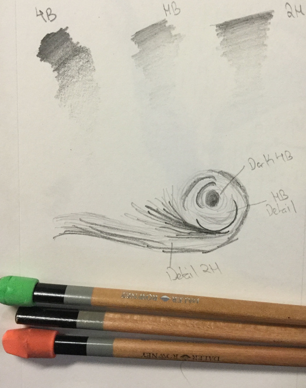
GRAPHITE
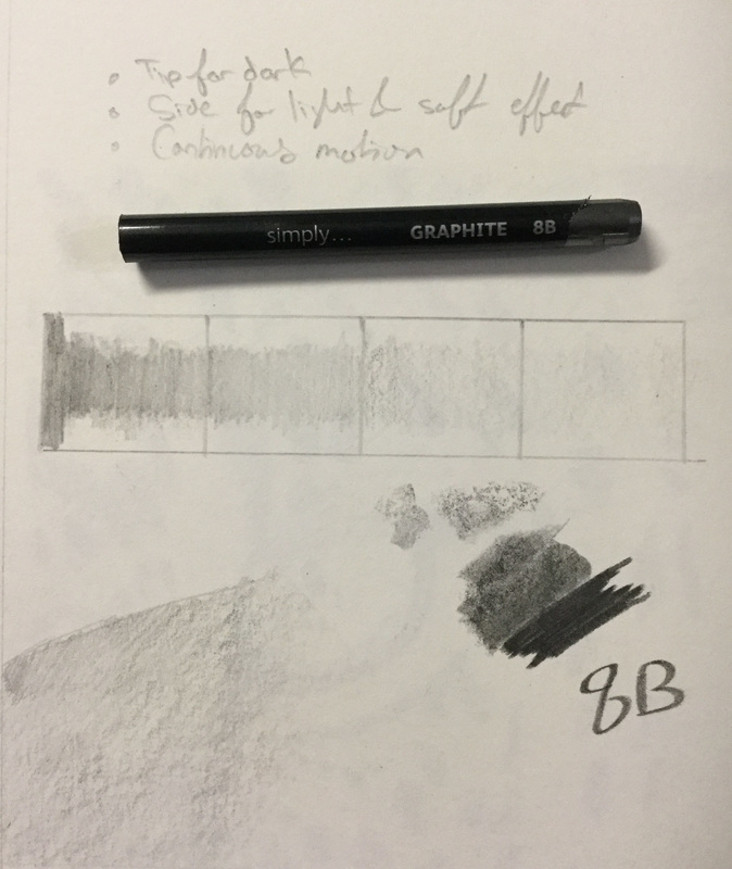
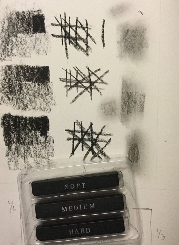
  Process/Experimentation: Done as the first piece in graphite, I only used a 2H and HB pencil and back then I did not know that those labels meant how hard the pencil lead is. I started off with a grid and an outline. Then I filled in the value with the side of the pencil, using only pressure to create dark and light values. Halfway through, an art friend of mine told me to use HB as it is both hard and soft and therefore able to create darker blacks. The hair was done with quick straight lines from the HB pencil.
|
  Process/Experimentation: Using a grid, the reference photo was drawn on the grid. I used slight indications of geometric shapes to indicate where I would give the the portrait form. For the bottom left, I experimented with blending using a paper towel on the graphite as it was a fairly large area to cover. For the eyes I used an 8B woodless graphite stick to give the portrait a focal interest. The hair was sub par as the reference photo did not provide much details. Towards the finish, I tried to blend the harsh outlines out of the portrait by erasing and reshading. It was a success in my opinion. For this portrait only a HB pencil and 8B graphite stick was used, ergo the portrait is light and does not have enough value and the illusion of form is weak.
|
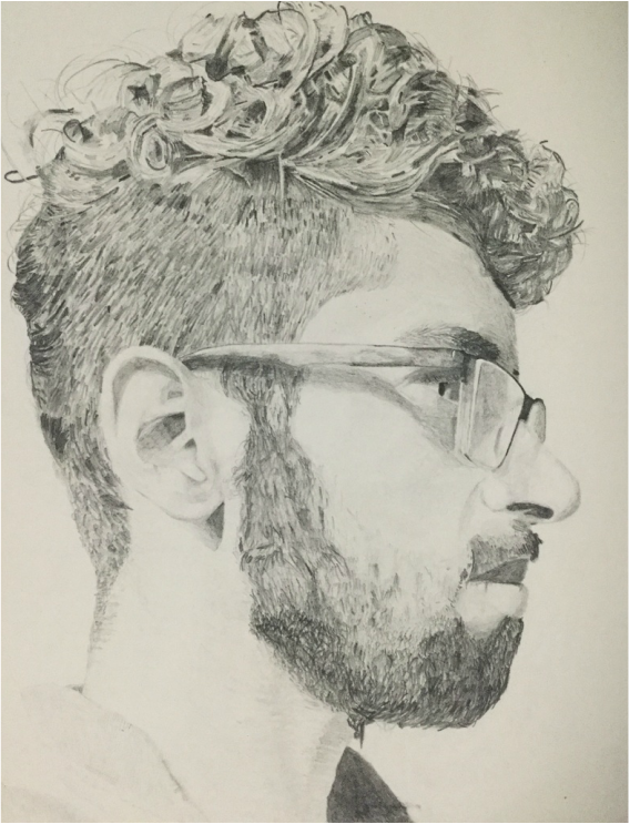
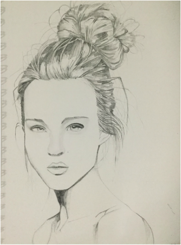
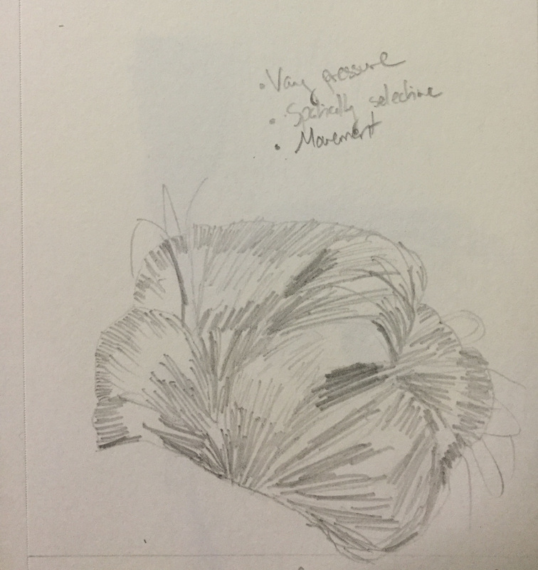
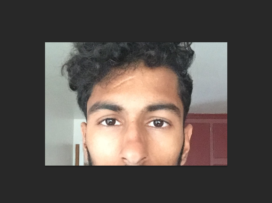
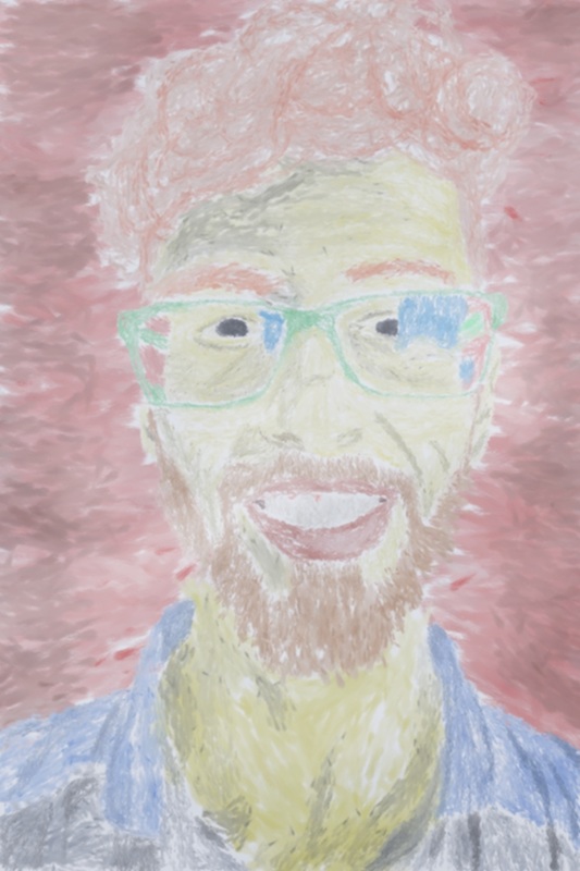
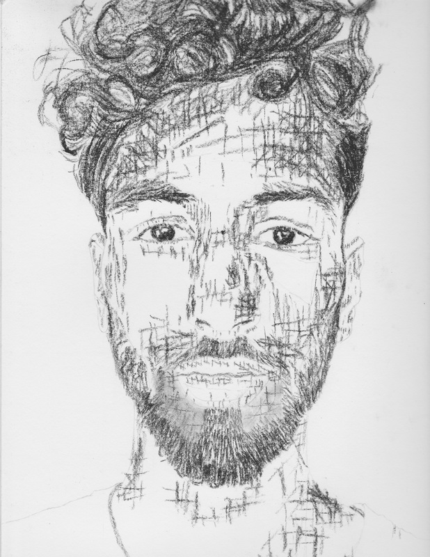
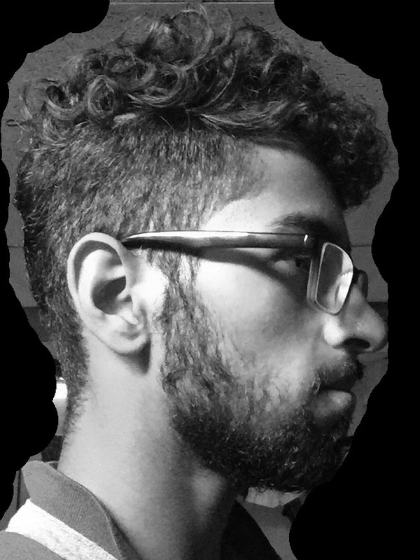  Process/Experimentation: Used a wide array of pencils ranging from 4B, HB, and 2H. This extensive portrait was an aim to achieve realism and almost perfect form. I worked on it grid by grid, referencing the picture tremendously. For the miniature details, a 2H pencil was used over the 4B and HB. Inspired by the detailed work of the Renaissance movement this is a piece that is captured the underlying muscles in the human face through value contrast. Where the value is very light, one can see the cheekbones and the protruding nose, and where it is dark one knows the absence of light refers to depth. Value and movement were used to represent the curly hair in a realistic aspect.
|
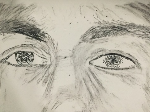
 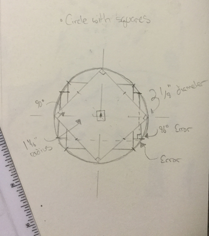 Process/Experimentation: Using Compressed Charcoal, a face was intended to be drawn. The focal point of the face was supposed to be the mandalas in the eye however, this was not successful. The mandalas could not be drawn to their full potential due to the irises. Since they were not fully visible and cut off, the mandala's symmetric effect was also reduced. In splitting up the circle and utilized geometry, I also fell short. Creating a mandala requires repetition and accuracy which were not characteristics of this art piece. The eyes of the piece look lifeless and flat. For future reference, I would stick with a simple design and see it to be completely accurate in terms of angles and congruency.
|
DIGITAL MANIPULATION
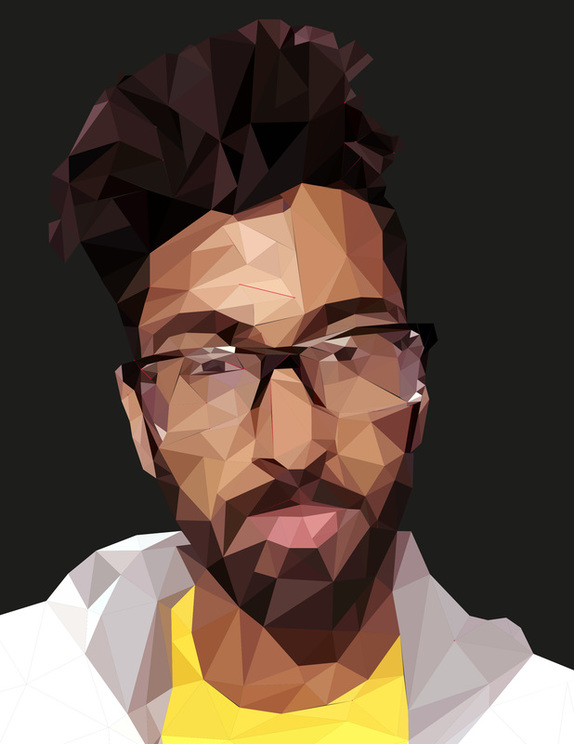
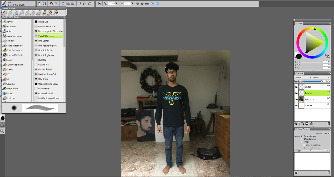
  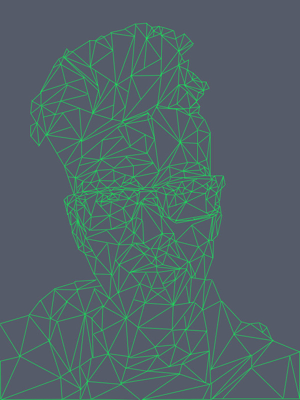 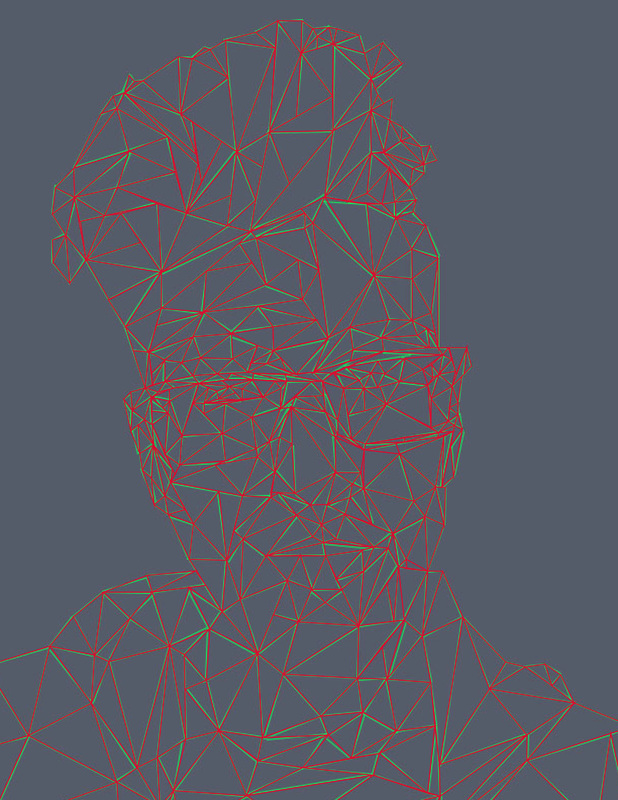  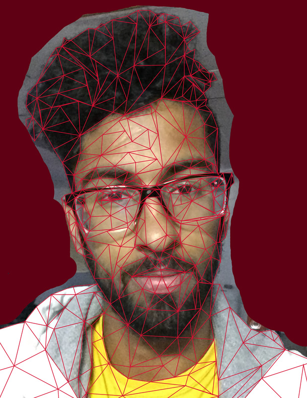 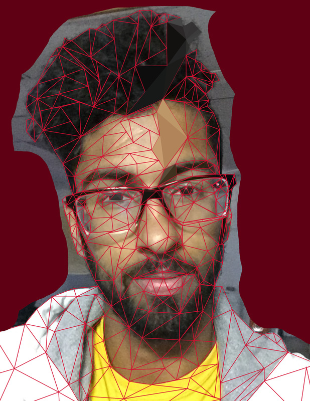  Process/Experimentation: This piece was made using Photoshop and Adobe Light-room. The process was a long and strenuous one. To begin I drew an outline of myself in triangles using a tablet and the pen tool in Photoshop. It was not important to make all the points connect. The only requirement was to have them near each other. Afterwards, I transferred the picture unto Light-room where I had to redraw the triangles and then make the points converge to one. With my reference tool, I sampled a color and filled it in. Making the triangles is a tedious process and it resulted in some red outlines of the triangles to be visible.
   Process/Experimentation: Made with Corel Painter, this piece was based off of the Fauvist and Impressionist movement. I emulated the colors of Fauvism and the brushstrokes of impressionism to create a self-portrait. Now that I had learned and done the process of digital painting, I knew the importance of layers and different brushes and blenders. First, I created an outline on a spearate layer. Then I went in with my base colors, employing the smooth brush movements of the impressionist movement. To add form, I used different brush opacities and layers.
    |
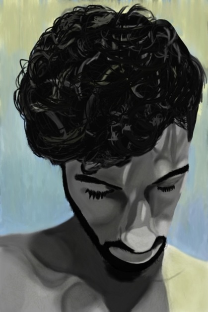
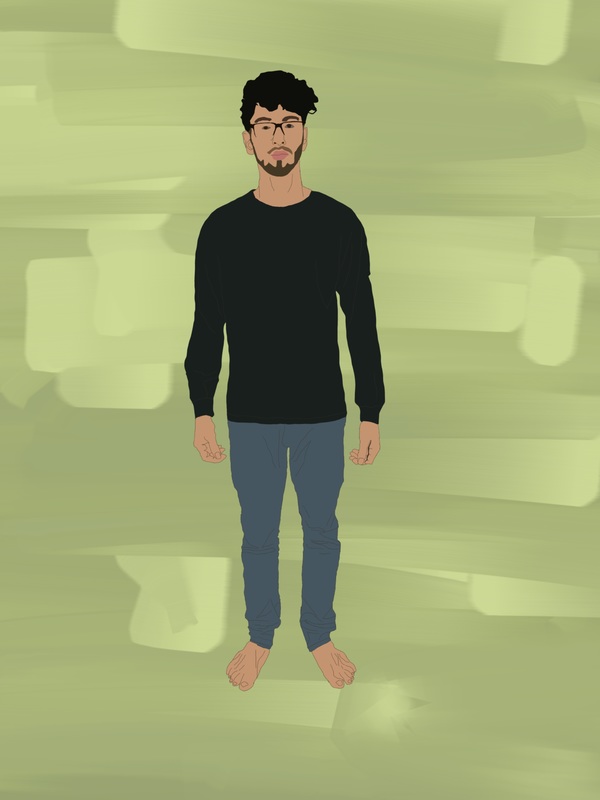
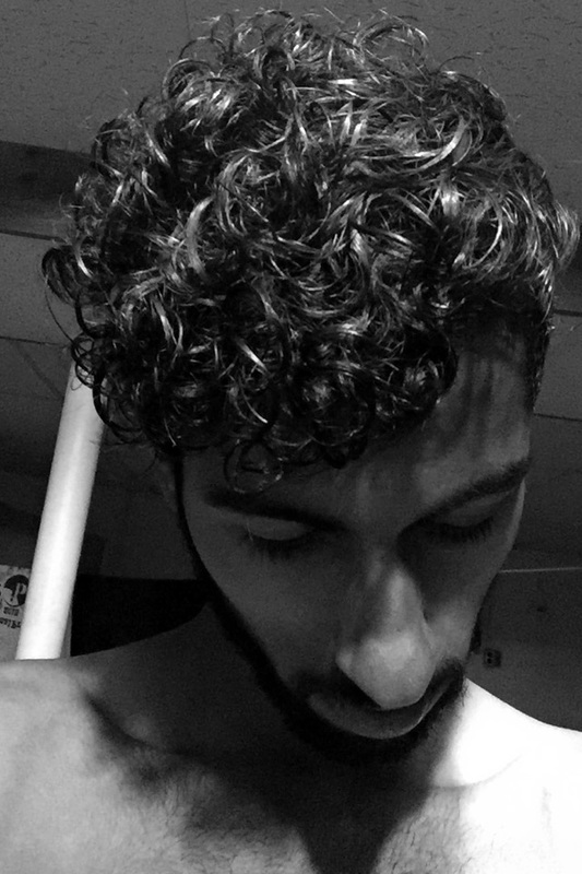 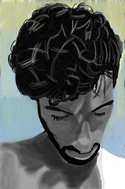 Process/Experimentation: This piece helped teach me the fundamentals of digital painting. Using the software, Corel Painter, I learned to utlize layers upon layers and different brushes to achieve the effect I wanted. I experimented with many different layers with the blending brushes as they were essential to this painting. In essence this entire piece was experimentation especially since my colors only consist of gray-scale with the background and left shoulder being the exception. Like all my works, this was based off of a reference picture that I took.
  Process/Experimentation: This piece was made in Photoshop using a reference picture I took of myself. This is sort of my technique for painting and drawing. I created 2 layers and referencing the value from the original I assigned each area an intensity on the gray-scale. I wanted to achieve a smooth texture and 3-D form which could've been better executed with transparency of the lines separating each compartment.
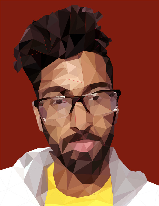
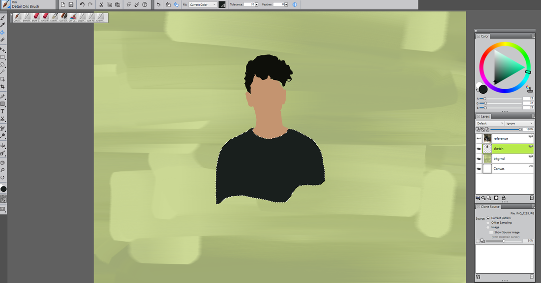
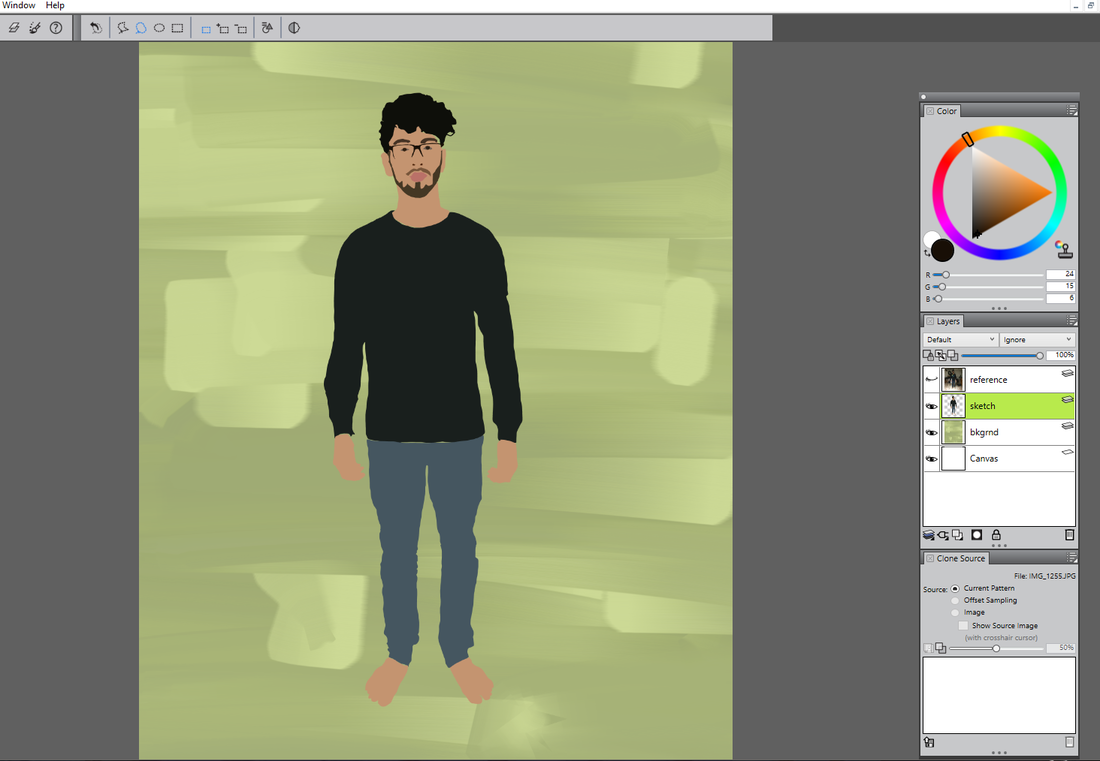
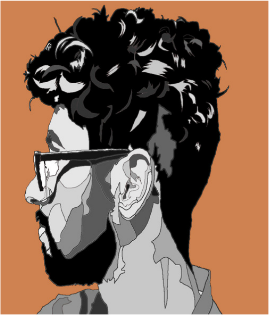
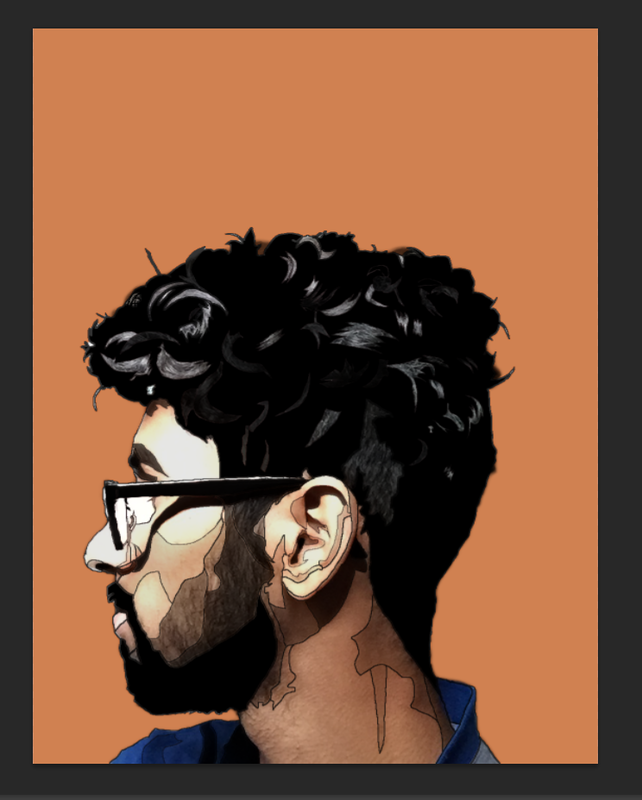
Process/Experimentation: This is the third piece created with the software Corel Painter. Using the lasso, brush, and paint bucket tool I created a a flat cut-out full body piece. First I utilized the referenced photo I took to select areas with the lasso tools and then filled them in using the colors present in the original photo. The final step consisted of outlining the facial shapes and the outline of the body. Through this piece I now know how to do the same thing using the same tool in Photoshop. I experimented with outlining the piece and found it better outlined. Since all the summer projects are explorations and/or experimentations with different techniques and mediums, I wanted to achieve creating art pieces that have flat colors with no evident brushstrokes so the piece has a smooth texture. This could be used for future digital pieces in which I need to color an image as the background and have the subject of the piece in the foreground.
|
MIXED MEDIA
  |
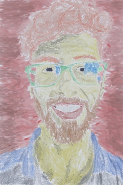
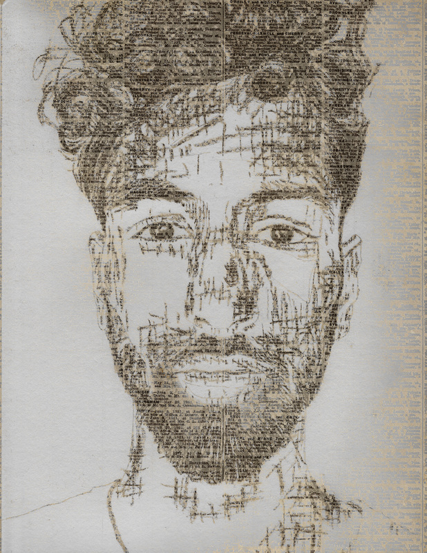
Process/Experimentation: The piece was an experiment using charcoal. I had used charcoal once previously and with this piece I wanted to investigate which shading technique would be most efficient with compressed charcoal. I used a grid and created an outline with a 2H pencil and then went back in with the charcoal. Crosshatching brought value to the work and the details in the eyes were done very carefully with deliberate movements, Crosshatching the hair would have removed any of the movement created by the curly hair in the reference photo so I decided to employ long organic strokes. After the portrait was complete, it was scanned in and using picture of a newspaper and Photoshop, the newspaper layer was placed on top of the portrait.
|
PEN
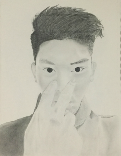
 Process/Experimentation: As an artist, I seldom freehand any of my pieces. This piece was an experimentation piece at free-handing. First done in pencil, as I had to erase a lot, and then done in pen. Constantly referencing my photo, I started with the extremity of the portrait, the right shoulder. Further in, I noticed that I had made a grave mistake. If one starts from the outside and works their way inside, a small mistake can lead to the entire portrait being disproportionate. As I always had trouble with proportions this portrait's lower part is slightly to the left than the top half. If I free-hand again, I will make sure to start with the eyes and work my way outwards. I also experimented with minimal detail in this piece. The geometric shapes below the cheek bones represent the areas of my facial hair that were considerably lighter than the rest, hence the lines are there as an indicator of that detail.
|
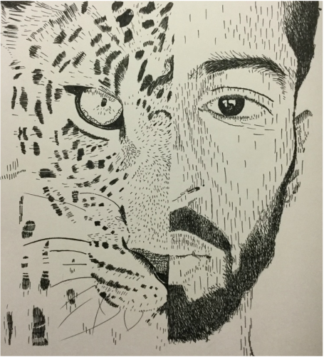
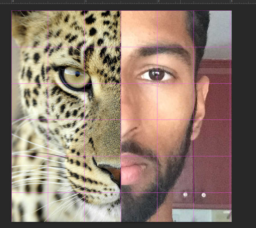 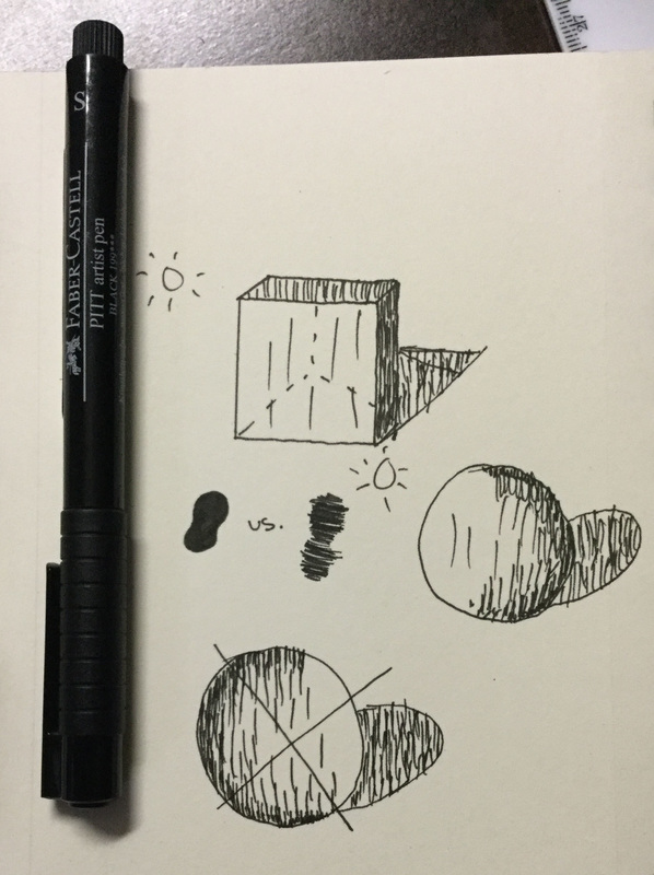 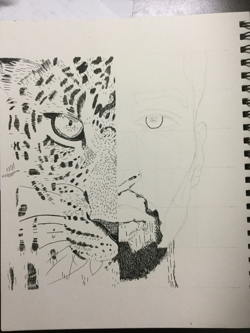 Process/Experimentation: Experimenting with the different self-portraits I could do, I decided to expand my horizons and draw half of my face as a cheetah. This was the first time I drew an animal in such juxtaposition with my face. I used pen to keep the piece in sharp black and white. I wanted to achieve value but not through blending of a graphite pencil or charcoal. I decided to use lines to indicate value. The further away the lines, there was lighter value and closer together created darker value. This technique aided in drawing the cheetah as on the reference photo there were so many tiny hairs that would have taken forever if approached at with anything other than small lines. The direction of the lines also created the movement of the cheetah's fur. I am pleased of the effect the individual pen lines have on my facial hair as it imitates how an actual beard appears to be. The final step in this piece was erasing the grid and the subtle outline.
|
