|
Title: Time
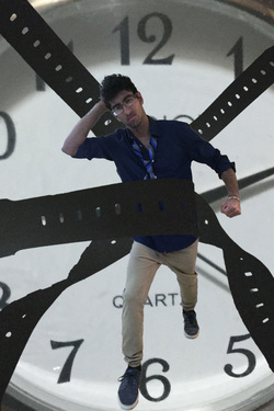
Medium: Digital Design Size: 61x91cm Date: September 2015 Exhibition Text: Inspired by Robert Longo's 'American Psycho', this digital collage incorporates the struggle against time. The boy is frustrated as he is restricted by the watch straps. The straps have him 'stuck' as he is trying to move. The watch in the background is a reminder that time plays a huge role in the life of this boy. The tie is disheveled and the fist clenched indicating the conflict with time. He is shown upset as the straps keep him immobilized, as time continues moving.
|
|
Process: This was a very lengthy process in which I got pretty frustrated. It was also a very long process which I spent an all nighter doing. For the results of this work, there were many so called final projects (three). The first one was one that I despised so so much. The Second one would suffice but it was really not what I was aiming for. I believe the third one, which is the one on the top of this page, is my final result and I do not hate it but it could definitely be better with a greater knowledge of the software, Photoshop CC.
Sketching: First, I received the loose guideline the digital collage had to represent, it had to be something about you. I sat down and thought about a simple idea I wanted to convey across using digital manipulation. I started sketching right away and I drew a vague figure in motion with these vines holding them. The motion in the picture definitely drew me towards Longo and after a little bit more thinking I started to figure out the details, I wanted to incorporate. I took a little bit of a surrealist approach and thought of Salvador Dali and Magritte with the clock. Originally I wanted the clock to be hiding my face and somehow I also wanted a silhouette of my body filled with ashes. There would have been two hands, each holding onto a 'vine' in which they would be pulling me in two opposite directions. These were a lot of ideas and I did not have the time to play around with them. I stuck with Longo because he wanted to project the menace and violence of city at night. I took the negative emotions that he wanted to portray and utilized them illustrate the boy's struggle against time.
Choosing: I chose because of the events that led up to me creating this project. At first, I used a digital SONY camera to take pictures of the various objects that I would need but the micro-SD card could not be inserted into any computer that was available to me. Those pictures were inaccessible. I took a break from the project for a while after that and then I resumed. The pictures that were used in this digital collage were taken with an iPad. I took pictures of a wristwatch, myself, a leather belt, and the watch straps of another watch. At this point, the message I wanted to convey would be attainable. Before, when I was taking pictures with the SONY camera, I wanted metal chains warping around me and restraining me but I did not have access to those materials. I had a weak chain that would have not sufficed so I'm glad the pictures were not available to me.
Editing: The pictures were put together using Photoshop CC. For my first result I was barely figuring out Photoshop so it took me a very long time. I isolated every picture using the quick selection tool and put all of them on one file, creating several layers. I had used a gold watch and that was way too flashy and was really not me. I tried to tone down the color using the Color replacement tool but that did not work out for me. I did not know how to properly use it and it would not change colors. It resulted in only changing the intensity and value of the hue which did not look good nor was what I had in mind. I also used the 'desaturation' option to make the watch straps darker. I did anything I could to try to get rid of the gold. Next, I played around with the watchstraps. I connected them to make them longer and used puppet warp to make the connected bits seem natural. The watchstraps were then attached to various locations on my body. Here, I really wanted to show the watch straps grabbing me, wrapping around me but I was stumped. I did not know how. I wanted the straps going towards the bottom (the ground) so it seemed as if I was actually being held down. I did not know how to achieve this as well, hence the watchstraps going off the picture in different directions.
My work: I feel as if I conveyed my message. I label this project successful. Is it perfect? No. It was a new medium that I worked with for the very first time and taking into consideration that fact, I think I did a decent job. A couple things I like about the final result is the background and the positioning of myself in the picture. The work has balance and I like the simplicity it has with just three things popping out: the watch head, myself, and the watchstraps. The color is a very dark brown and almost indistinguishable from black. I wish I could've made it brown. The quick selection around the left watchstrap was not perfect and it looks choppy and unnatural. I would like to improve that. I also want the watch straps to look like they are actually wrapping around me and grabbing me, pulling me to the ground. The ideas are all there but the execution definitely needs work. This level of successful can be obtained with increased knowledge of Photoshop CC and time.
|
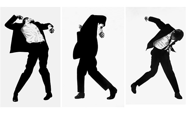
Longo, Robert. Men in the Cities. 1979. Photograph. University Art Museum, Long Beach.
'Final' #2: The next day, I began to work on my project again. I hated what I had created. To get rid of the flashy look, I used a different wristwatch which was less intricate and bold. I decided to ditch the metallic watchstraps and use the watchstraps of a white plastic wristwatch that I have. I did not like the color white however so I took a picture of a leather shoe so I could replace the white. I took pictures of the watch in different positions (straight, curved, spiraled) so I did not have to mess around with puppet warp. I began working on Photoshop again, using the quick selection tool and refining the edges of the objects I had selected. I did not have to mess around with color which was great. However, replacing the white with the leather was not as simple as I had thought it was and I spent a lot of time going around in circles. I had to use a layer mask, click 'reveal all' and simple copy and paste. I figured out how to replace the texture of one of the watch straps and then as soon as I was about to begin on the few more I had left, I had forgotten or done a misstep. Eventually, I figured it out and at that point as soon as all the objects were on one background layer, I was 'finished'.
Final Result: After a week or so, after being told by a friend that my watchstraps look like seaweed, I decided to revisit my digital collage again. I used a different texture (of a belt) and this time around made sure I took the picture without the reflection of an artificial light source. So, it was back to the shop again. I thought to myself about how I had to do the texture all over again and what a pain it was last time. It had been a while and I didn't even remember exactly how I did what I did last time but this time, by a stroke of luck, the process was even easier. To put the leather texture on top of my white watchstrap, I simply clicked 'create clipping mask' and viola! It had been done. After that, I changed the position of straps and myself slightly and re-sized some aspects.
|
Word Count: 1396
